Every additional step taken during checkout lowers the likelihood that the consumer will complete their transaction, according to the unwritten rule of eCommerce. It is proven that the average cart abandonment rate is nearly 70%, which represents a considerable loss in potential revenue.
Online merchants are looking into solutions to accelerate the customer’s process for final payment to reduce these losses and increase conversions. The days of intimidating, lengthy checkout forms are over. To assist eCommerce companies in streamlining the complicated checkout processes, the one-page checkout solution emerges.
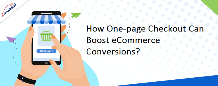
How a Single-Page Checkout can Boost Sales?
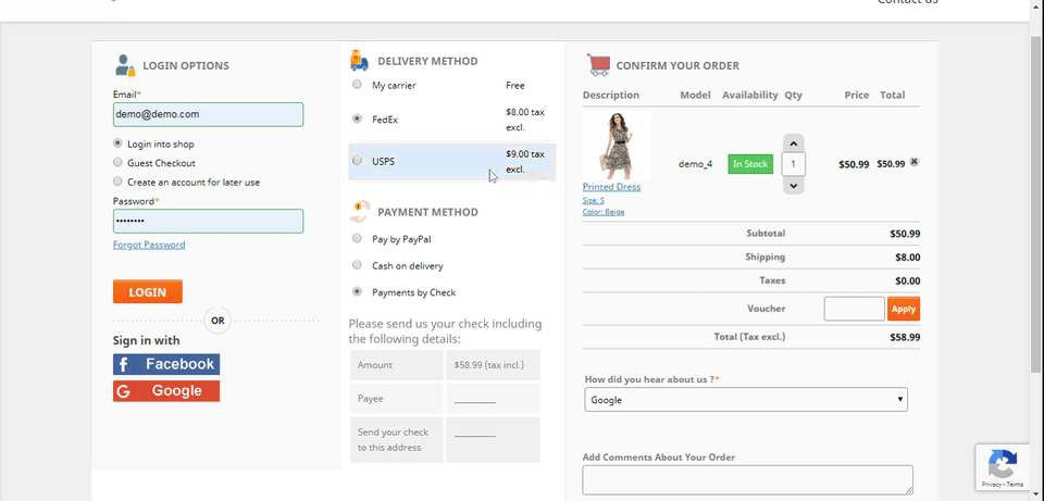
Once you are aware of the potential losses caused by complicated checkout processes, you should think about making it a single page. The benefits of adopting a one-page checkout for your online store are listed below.
Minimizes Cart Abandonment
Users won’t have to deliberate over their options for very long if your checkout process is simple. You can decrease the rate of cart abandonment by shortening the path to buy by removing all redundant form components.
Drives Higher Conversion Rates
Your company will maximize conversions and increase earnings by boosting the number of purchases made on its website. Additionally, repeat consumers don’t want to complete the form all over again. Get them to pay before their mind changes.
Quick and Simple to Comprehend
Any website that makes it easy for users to quickly reach the payment page after filling out a form will see increased traffic and increased sales.
Increases Consumer Satisfaction
When a customer uses your website, the last thing you want them to think is more about checkout forms. Every time a consumer sighs in frustration, they lose faith in your platform, which degrades the entire user experience.
How Checkouts Become More Efficient?
I’ve few effective suggestions for enhancing checkout routines after studying a few eCommerce websites. When creating your online store or vendor marketplace, use these suggestions.
Reduce the number of pages
This topic has been repeatedly brought up in this article, and with good reason. Whether using the desktop or mobile version, the checkout process must be linear. Any additional pages that require the customer to go an extra mile shouldn’t be included in the checkout process.
Include details
Removal of any extraneous components from the page is important for checkout optimization. But in their pursuit of simplicity, brands sometimes over-optimize. Whatever you do, be sure the fields are labeled.
Additionally, employ alerts and error messages to instruct the user on how to locate the CVV on their credit card or when the password is “too weak.” Finally, you must never presume that the reader is aware of the appropriate course of action.
Clean up the page
Retailers cross-sell and upsell products on the checkout page. Improperly implementing this strategy can scare customers away from your one-page checkout it will affect sales.
In addition, a checkout page with too much text and information can deter users from finishing their purchases. So, think about reducing the page to its very minimum, simply leaving the navigation bar, the footer, and the form itself.
Make Registering a Choice
Online buyers are often hesitant to divulge their personal information on websites due to privacy concerns. Because these customers make up a sizable portion of paying customers, a business owner needs to empathize with them.
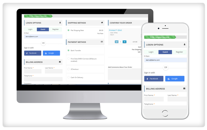
Always make it possible to log in without registering. You can put this behind the forms where users can submit only their billing and shipping information to share sensitive information. As an alternative, you can offer customers free shipping as a persuasion tool to give you their data.
Conclusion
Simplifying complicated checkout processes will increase conversions while also enhancing the buying experience on your eCommerce website. By using the advice provided in this article, you can drastically lower the rate of cart abandonment.
Just strive for a straightforward layout that strips the page of extraneous details and elements. Most importantly, keep testing and refining the checkout page until you find the one that ensures the majority of sales. You can contact the Knowband team to know more about this plugin or any other plugins. Contact us at [email protected] for any queries or customization of the plugins.


